fluticasone
neru
fontcallfontcall
juggernaut
fluticasone
-
int.check
-
overdoseA grid-style layout that prioritizes its readability regardless of device. Key point is the gradient text title - if you're css-savvy enough to change the gradient from the standard linear angle I have, you can make it any style you'd like. I recommend punchy high-saturation colors as your accent with a more toned down background - it makes the overlay blend stand out! It uses a backdrop-filter to blur and desaturate what's behind the content, so your text should be readable regardless of how busy the background image you choose is.
night owlNight Owl is a full thread that offers role slots with a horizontal scroll and specific "screens" for each section instead of tabs. It's not the most readable layout, but it's fully mobile compatible. The background is done via blurring filter and layering a noise image on top. It's slightly darkened, although I believe most can figure out how to adjust that to meet their preferences. Almost everything is done using position absolutes.
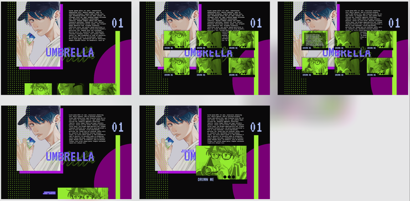
umbrellaThe closest description for Umbrella would be a portfolio-type layout with a section for informational text. Each "section" is contained within its own imagel it's originally designed for 1x1 searches with specific plots or fandoms in mind. Alternate usage is for location or NPC information in roleplays, using the tag system to give players the quick and dirty. There's a lot of colors involved, so it may take a bit of experimentation to achieve a coherent scheme. Probably the least beginner-friendly of the layouts posted here.
venus flytrapA very clean interest check/character sheet layout that's inspired by museum brochures/leaflets. Plenty of room for information, making it ideal for text-heavy roleplays while avoiding intimidating walls of text. The navbar moves to the top of the post on mobile for easy access. Pretty beginner-friendly in terms of what I have provided here so far.
-
c.sheet
-
night owlThe CS that accompanies the interest check layout. This is definitely on the simpler side in terms of, though the way it appears makes it seem otherwise. There's room for basic information, a role, kanji or maybe a nickname, a quote, and a combined backstory/personality section.
mr. cleverA really clean layout which features gradients and an area for a pokemon team. There's lots of room to shove information into, and it's rather simple to add and remove areas. It works especially well for faceclaims with limited images as it only requires a 100x100 icon.
moon nightA grid-style strictly black and white character sheet that's especially good for people who have several images they want to use. On mobile, it collapses into a single column layout. There's a filter applied to all images so you don't need to worry about that either.
limboA simple layout geared towards 1x1 blurb-type character sheets. There's room for personalization, as well as a section for side characters that expands in height alongside the character cards to the left. In mobile, the main character cards collapse into a single column while the side characters become a scrollbox at the end of them.
riverA really simple character sheet I made for 1x1's, but can easily be expanded to accommodate additional details for group roleplays. It has very minimal features, but it also means it's quite easy to fill out and edit everything even for beginners.
-
misc
-
why does a ♡ break?An extremely generic layout for in-character posting that I made for my own RP because I deadass forgot that was a thing. There's space for information like location, mood, etc. You can keep adding if you want. The tags are located at the very end, where they'll show up as user icons on the bottom righthand corner.
juggernaut
i'm mono. all codes are free for use and modification. i focus on cross-device compatibility and accessibility rather than making things "pretty" please ensure RTE is off when using my codes. feel free to ask questions!
01.11.2024
last updated
open [2/2]
request availability
Last edited: