• When posting, please be aware that artistic nudity is still nudity and not allowed under RpNation rules. Please edit your pictures accordingly!

    Remember to credit artists when using work not your own.

We Are Art Café

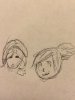
[QUOTE="Aldur Forgehammer]So, here's the thing. I really wanted to post something here from the beginning, but I either couldn't find the time or inspiration. That being topped with my PC not recognizing the tablet drivers 4 out of 5 times I start it up really annoyed me and I could only give advice. But alas, I can finally post something here. It took me around 4 hours to complete and I'm proud of it.
View attachment 233784

[/QUOTE]
Very beautiful!


(I might have lurked on Thalassa and recognized Eve)
 
[QUOTE="Lilah Tunth]Very beautiful!
(I might have lurked on Thalassa and recognized Eve)

[/QUOTE]
I've been planning a visual update for a while and I'm really happy with how it turned out :D And I hope Thalassa's as entertaining to read as it is to play in it.
 
[QUOTE="Aldur Forgehammer]Thank you so much! I'm sorry I didn't color your piece though. I'm gonna try to do it when my pc isn't acting up.

[/QUOTE]
You're all good! It's suppose to be a fun expirence not a hassle, enjoy it when your good and ready!
 
Renders are art too? ;-;


I feel so out of place...


xynavus_by_shinzah-d9qsyr6.jpg
 
I am in so much love with this thread... I want to learn how to draw SO BADLY. Because when I was younger, I wasn't bad - unskilled, but not horrible. Then I started to write and I lost any drawing ability I had! I need to read this over tomorrow while at work and test it out... <3
 
Welp.


I had a phone (which is pretty horrid) with me. And managed to draw this.......
:P


I didn't have much time soooooo.....


<p><a href="<fileStore.core_Attachment>/monthly_2016_02/9bf48774-e33f-4e6e-b70f-308c83e22baf.png.3b47710cb11e918295201d08d813e402.png" class="ipsAttachLink ipsAttachLink_image"><img data-fileid="105238" src="<fileStore.core_Attachment>/monthly_2016_02/9bf48774-e33f-4e6e-b70f-308c83e22baf.png.3b47710cb11e918295201d08d813e402.png" class="ipsImage ipsImage_thumbnailed" alt=""></a></p>


Attachments

  • 9bf48774-e33f-4e6e-b70f-308c83e22baf.png
    9bf48774-e33f-4e6e-b70f-308c83e22baf.png
    147.5 KB · Views: 140
Last edited by a moderator:
<p><a href="<fileStore.core_Attachment>/monthly_2016_02/image.jpg.821be01b11e282dc8c349b4b4beb89ee.jpg" class="ipsAttachLink ipsAttachLink_image"><img data-fileid="105261" src="<fileStore.core_Attachment>/monthly_2016_02/image.jpg.821be01b11e282dc8c349b4b4beb89ee.jpg" class="ipsImage ipsImage_thumbnailed" alt=""></a></p>


"Yo, does the menu include clothing? Need some new jackets here." (Le quick sketch before lab)


Attachments

  • image.jpg
    image.jpg
    933.3 KB · Views: 144
I'm here- I'm here!


Alright, on Klement's palette.


<p><a href="<fileStore.core_Attachment>/monthly_2016_02/klempalette.jpg.61450834ae435b0700a19a3ca13cc6b4.jpg" class="ipsAttachLink ipsAttachLink_image"><img data-fileid="105434" src="<fileStore.core_Attachment>/monthly_2016_02/klempalette.jpg.61450834ae435b0700a19a3ca13cc6b4.jpg" class="ipsImage ipsImage_thumbnailed" alt=""></a></p>

image-png.232498

Okay now. Klement's a bit tricky, whilst being quick to understand. I didn't go off of the palette sheet, instead, I ripped as many colours from the finished project as I could, if that makes sense.


1) If you do what I did here for lineart, the colours will be darker and scattered about, greens and purples and reds. That's fine, because it's supposed to be like that.


2) Skin tones. Choosing the top colour in the orange section isn't usually the best idea. Of course, it depends what colour of skin the character has, but no matter what, I've never found myself going over to the right side of the colour grid. usually too intense. (Unless it's purposely supposed to be that way, but this entire tutorial follows this mindset.) I find myself sticking closer to the left side, and going up and down from there. General rule of thumb- Tanner = Closer to red; Paler = Closer to yellow. Although you'll actually find yourself never going into actual "yellow territory."


3) Hair. pretty basic. 5-ish colours is a pretty standard thing, or course, everyone has seen wayyy more. There's a standard hair colour/filler, a colour for shading, and two forms of shine. I will fight against pure white hair shine. Choose a lighter, yet dull colour. Not even joking. For streaks, choose a very bright version of the colour, especially if you're using an airbrush tool. (I actually did that here. wow.) I think I might've used the top/right green for his streaks here, but I probably lowered the opacity afterwards. When ripping the colour, it didn't even show up as near the top, more near the middle. I'm terrible at explanations, next.


4) Clothing. His lab coat isn't pure white. There isn't any "pure white" or "pitch black" on this piece. There's some very close stuff, but when looking through Mother 3 sprite colours, there was a serious aversion to black. Burnt drowns and deep blues were all in, but I rarely saw any "0000" black. I've added that to my art as a whole. The creases have an "almost blended" feel when compared to the shade. His shirt is navy. The white on the beaker contrasts with the dark colour, but it agrees with the green inside (I made a gradient there, kek kek). His jeans are a softer, bleached blue. If I had done something as strong as the shirt, it would've all mucked together.


5) Arm. If one of these things is not like the other, it would be the mech. Only made of four colours, and contrasting from his overall cooler colour palette. For one, it could show that it's not truly a part of him. You can do a lot of symbolic stuff in art. There's not too much too much I can describe here, aside from how I used more matte colours. Yellow/white makes a warmer, softer white.


The other stuff is the background and whatnot. A little thing I do is that I usually signature my art in the least used colour. If I hadn't used that yellowey colour, I would've used the his glasses' colour. I recommend saving skin, hair, and the general colours to a swatch somewhere. The shadows and light typically change.


terrible "tutorials", man.


Attachments

  • klempalette.jpg
    klempalette.jpg
    115.1 KB · Views: 120
Diminium said:
I'm here- I'm here!
Alright, on Klement's palette.


View attachment 235423

image-png.232498

Okay now. Klement's a bit tricky, whilst being quick to understand. I didn't go off of the palette sheet, instead, I ripped as many colours from the finished project as I could, if that makes sense.


1) If you do what I did here for lineart, the colours will be darker and scattered about, greens and purples and reds. That's fine, because it's supposed to be like that.


2) Skin tones. Choosing the top colour in the orange section isn't usually the best idea. Of course, it depends what colour of skin the character has, but no matter what, I've never found myself going over to the right side of the colour grid. usually too intense. (Unless it's purposely supposed to be that way, but this entire tutorial follows this mindset.) I find myself sticking closer to the left side, and going up and down from there. General rule of thumb- Tanner = Closer to red; Paler = Closer to yellow. Although you'll actually find yourself never going into actual "yellow territory."


3) Hair. pretty basic. 5-ish colours is a pretty standard thing, or course, everyone has seen wayyy more. There's a standard hair colour/filler, a colour for shading, and two forms of shine. I will fight against pure white hair shine. Choose a lighter, yet dull colour. Not even joking. For streaks, choose a very bright version of the colour, especially if you're using an airbrush tool. (I actually did that here. wow.) I think I might've used the top/right green for his streaks here, but I probably lowered the opacity afterwards. When ripping the colour, it didn't even show up as near the top, more near the middle. I'm terrible at explanations, next.


4) Clothing. His lab coat isn't pure white. There isn't any "pure white" or "pitch black" on this piece. There's some very close stuff, but when looking through Mother 3 sprite colours, there was a serious aversion to black. Burnt drowns and deep blues were all in, but I rarely saw any "0000" black. I've added that to my art as a whole. The creases have an "almost blended" feel when compared to the shade. His shirt is navy. The white on the beaker contrasts with the dark colour, but it agrees with the green inside (I made a gradient there, kek kek). His jeans are a softer, bleached blue. If I had done something as strong as the shirt, it would've all mucked together.


5) Arm. If one of these things is not like the other, it would be the mech. Only made of four colours, and contrasting from his overall cooler colour palette. For one, it could show that it's not truly a part of him. You can do a lot of symbolic stuff in art. There's not too much too much I can describe here, aside from how I used more matte colours. Yellow/white makes a warmer, softer white.


The other stuff is the background and whatnot. A little thing I do is that I usually signature my art in the least used colour. If I hadn't used that yellowey colour, I would've used the his glasses' colour. I recommend saving skin, hair, and the general colours to a swatch somewhere. The shadows and light typically change.


terrible "tutorials", man.


Wow......


SO AWESOME!
 
<p><a href="<fileStore.core_Attachment>/monthly_2016_07/Untitled.png.05d2a8db60b3aacc29fa8c2895c7939a.png" class="ipsAttachLink ipsAttachLink_image"><img data-fileid="139343" src="<fileStore.core_Attachment>/monthly_2016_07/Untitled.png.05d2a8db60b3aacc29fa8c2895c7939a.png" class="ipsImage ipsImage_thumbnailed" alt=""></a></p>


Attachments

  • Untitled.png
    Untitled.png
    11.3 KB · Views: 65
Lilah Tunth] [FONT=Cookie]@Sugar Honey Iced Tea[/FONT][FONT=Cookie] We should give you and your stickman an award[/FONT] [FONT=Cookie] :3[/FONT] [/QUOTE] <p><a href="<fileStore.core_Attachment>/monthly_2016_07/Untitled.png.ee3574b681497e71c8068dc9f24469b1.png" class="ipsAttachLink ipsAttachLink_image"><img data-fileid="139345" src="<fileStore.core_Attachment>/monthly_2016_07/Untitled.png.ee3574b681497e71c8068dc9f24469b1.png" class="ipsImage ipsImage_thumbnailed" alt=""></a></p> [URL="/monthly_2016_07/Untitled.png.ee3574b681497e71c8068dc9f24469b1.png said:
 

Attachments

  • Untitled.png
    Untitled.png
    9.8 KB · Views: 63
Last edited by a moderator:
aaa im back ;;u;; good to see this thread is still up!
 
Last edited by a moderator:
tumblr_oand66AZB91qjd742o1_250.png


Hey guys, sorry for not dropping by here in a LOOONG time. (Yikes) I am glad that people have been posting and chatting with others around here!


I've been actually away from RPN for a while back and just a few weeks back, have I came back from to rp an old favourite. Ahah. Welp.


Question: Do anyone have a long time favourite rp in RPNation? Can be old or new.


tumblr_oand66AZB91qjd742o2_250.png


But boy, is it hot in here! I'll be right back.


tumblr_oand66AZB91qjd742o4_400.png


That's much better.


tumblr_oand66AZB91qjd742o3_250.png


Sorry for the wait, I'll get some "work" done
 
Chiberz said:
I am in so much love with this thread... I want to learn how to draw SO BADLY. Because when I was younger, I wasn't bad - unskilled, but not horrible. Then I started to write and I lost any drawing ability I had! I need to read this over tomorrow while at work and test it out... <3
Thanks for enjoying this thread! Sorry for this beening super late, but I hope you continue to enjoy what the people of RPN have put in here!


Sorry to hear about the stuggle. I can understand how that feels, able to draw but forgetting it later in life. I find it easy to just not pick up my tablet or a simple pen and just doodle, letting the drawing skills to rust. But i hope that this thread gives you inspiration to pick up a pen and doodle!


Heys @Lilah Tunth


tumblr_oand66AZB91qjd742o8_250.png


Heys @Bolts


tumblr_oand66AZB91qjd742o9_250.png


And hey hey there good looking, @Diminium


tumblr_oand66AZB91qjd742o7_250.png


Nice colour pallet. ! (Sorry for lack of colour here ; ;) You have thought deep about Klement. Gonna be tough to remember the details :P

@Entarriance[/URL]


Hey hey!


tumblr_oand66AZB91qjd742o5_400.png


You're never late to join the party! Glad you're enjoying the Café and I hope you have fun here!
 
<p><a href="<fileStore.core_Attachment>/monthly_2016_07/image.jpg.bbc9cddf59e5c163ba40cd3ff76570dc.jpg" class="ipsAttachLink ipsAttachLink_image"><img data-fileid="144440" src="<fileStore.core_Attachment>/monthly_2016_07/image.jpg.bbc9cddf59e5c163ba40cd3ff76570dc.jpg" class="ipsImage ipsImage_thumbnailed" alt=""></a></p>

Oh, hey, what up?


Yeah, Kinda have pen and paper at the moment since I am moving. No tablet for a while.


Attachments

  • image.jpg
    image.jpg
    920.8 KB · Views: 47
<p><a href="<fileStore.core_Attachment>/monthly_2016_07/superthumb2.png.b6c1c55404ee7a63361e1c3f28c3fcf2.png" class="ipsAttachLink ipsAttachLink_image"><img data-fileid="144447" src="<fileStore.core_Attachment>/monthly_2016_07/superthumb2.png.b6c1c55404ee7a63361e1c3f28c3fcf2.png" class="ipsImage ipsImage_thumbnailed" alt=""></a></p>


*Yawns* It's late here, but i want to say Hello to every one before i take froggy and myself to bed.


Have a nice night.


Attachments

  • superthumb2.png
    superthumb2.png
    91.8 KB · Views: 41
<p><a href="<fileStore.core_Attachment>/monthly_2016_07/image.jpg.45686ad8cd8304d6b559e549eb4e0cdf.jpg" class="ipsAttachLink ipsAttachLink_image"><img data-fileid="144653" src="<fileStore.core_Attachment>/monthly_2016_07/image.jpg.45686ad8cd8304d6b559e549eb4e0cdf.jpg" class="ipsImage ipsImage_thumbnailed" alt=""></a></p>


*Almost off of work around midnight* "Alright, after these drinks are served i'm, out of here!"


<p><a href="<fileStore.core_Attachment>/monthly_2016_07/image.jpg.1a902071329fa987b1f5986e79587379.jpg" class="ipsAttachLink ipsAttachLink_image"><img data-fileid="144654" src="<fileStore.core_Attachment>/monthly_2016_07/image.jpg.1a902071329fa987b1f5986e79587379.jpg" class="ipsImage ipsImage_thumbnailed" alt=""></a></p>


*quickly hided hair back inside hat* "Let's check rpnation. What could go wr- ... Oh"


<p><a href="<fileStore.core_Attachment>/monthly_2016_07/image.jpg.c7bb97a9480e0678cddaf62074c0876c.jpg" class="ipsAttachLink ipsAttachLink_image"><img data-fileid="144655" src="<fileStore.core_Attachment>/monthly_2016_07/image.jpg.c7bb97a9480e0678cddaf62074c0876c.jpg" class="ipsImage ipsImage_thumbnailed" alt=""></a></p>


"Sorry, I'll get right on that.. Heh.." @TripTripleTimes


Attachments

  • image.jpg
    image.jpg
    877.7 KB · Views: 7
  • image.jpg
    image.jpg
    863.7 KB · Views: 8
  • image.jpg
    image.jpg
    888.1 KB · Views: 8
Last edited by a moderator:

Users who are viewing this thread

Back
Top