Hey!! so ive started looking for an mlp rp and I'm drawing some of the characters I wanna use! here's my sona Lemondrop!! I did use a base but the hair and tail are mine!!! Any advice for colors, looks, etc?
Lemondrop looks very cute! I love the muzzle spotting and the darker socks, and I like the eye color a bunch! My only advice would be to fiddle with the cutie mark. The overall design and silhouette is really strong! But pith and the fruit of the lemon are far too similar in value, so it's hard to tell them apart. Also most cutie marks in the show don't have such a harsh outline, if they even have one at all (as most don't and are simple color blocks).
I think adjusting the value of the inner fruit so the white lines are more visible is the biggest bit of advice. And if you want to go a little further, reducing the line thickness / changing its color to something not black on the cutie mark's outline or even trying for a colorblock design would go a long way. Right now it's not bad, the thick black outline just gets in the way a little of your already very strong design!
and for the outlines, yeah! having it be colored no longer takes away from the yellow of the cutie mark. i'd say the yellow and the white are still too similar in value, as you want to have strong contrast in your designs for easy readability, a lot like lemondrop's hair!
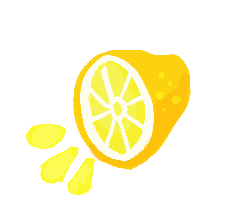
i made a little scribble as a palette idea, i hope that's alright! you don't have to use it if you don't want (but you can if you do!) i just explain things better with images lakshdjgk
it's really hard with yellow, so i totally get it bc if you go too dark it looks like an orange aksjhdg and it doesn't help yellow is one of digital screen's weaker color ranges
but something like this is what i'd personally try if trying to get the pith to not blend in to the flesh of the fruit ! which you are welcome to use the colors if you like, but if you're not digging them that's totally fair LOL and big apologies if i overstepped
OH! you updated since last i saw !! i was struggling so much with getting the yellow to not desaturate on upload i missed your second post (and almost hit enter without seeing it LOL)
the cutie mark on lemondrop's flank is wonderful !! the pith doesn't blend in it stands out really well, the colored outlines really let your choice in colors shine
i think it looks great and you did a wonderful job !!


.png")