It seems that darker gives people headaches, completely confused. You guys want dark or light  .
.
.
Follow along with the video below to see how to install our site as a web app on your home screen.

Note: This feature currently requires accessing the site using the built-in Safari browser.
.How about now?Alexandra said:It's not my personal taste; colour is just colour after all, and I actually really like black/white/gray combinations. It's more that I am having trouble seeing the posts after a while because pale grey and white shimmer and glare against the dark background, making reading really difficult.
Unbridled Originality and Feantari posted two darker greys as text options, and they are much less painful to read; so darker text would be my chosen option.
")
If we have to have light text on a dark background, then the current grey is good.Feantari said:This one feels smoooth when reading. Doesn't have the glare-y feeling the brighter colors do. I'm curious what others are thinking though since my opinion isn't a strong one.
You can already click on blocks and it takes you in O.o .....It does for me on all my browsers, you sure you don't have something disabled?Cirno said:Hiyo. I'm sorry to hear that you received personal insults earlier.
Just transferring some of the comments I made in the other thread. Again, not page-breaking bugs as much as style tweaks.
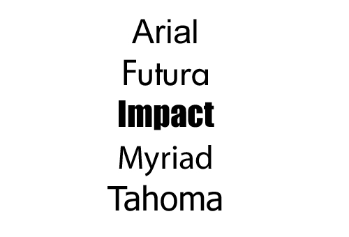
1. Bebas Neue (the font used for forum names on the home page and our usernames in posts) is hard to read. Maybe the font Impact will do what you want?
2. It'd be nice to be able to click on the blocks (and not just the title link) to get to the forum. I turned up a search regarding click events on divs earlier (it was for work).
3. Not said by me, but regarding the light text on dark bg: I think switching to a sans serif for the posts might help too. (I see there's already color tweaking on that going.)
Feantari: There's a preview option if you click on "More Options..." (Agreed that one less click would be nice though.)
I think just increasing the tracking on Bebas Neue could work. I've used Impact before, and it has similar "squishing" issues.Cirno said:<snip>
1. Bebas Neue (the font used for forum names on the home page and our usernames in posts) is hard to read. Maybe the font Impact will do what you want?
2. It'd be nice to be able to click on the blocks (and not just the title link) to get to the forum. I turned up a search regarding click events on divs earlier (it was for work).
3. Not said by me, but regarding the light text on dark bg: I think switching to a sans serif for the posts might help too. (I see there's already color tweaking on that going.)
Feantari: There's a preview option if you click on "More Options..." (Agreed that one less click would be nice though.)
So you dislike the "White" I used earlier?Alexandra said:I think just increasing the tracking on Bebas Neue could work. I've used Impact before, and it has similar "squishing" issues.
And yes; I too would love a san serif typeface for large pieces of copy; not only would it increase legibility, picking one that has a good bold and italic version means people can still have the dialogue and highlighting options they like to implement in their threads. It would also match the san serif of the rest of the site.
It may be quite dark, but this is probably the only way light text on a dark background is going to work without actively impeding reading

As a bug.Feantari said:The code block has a white background with black text still. Is this as intended or a bug?
Have you tried double-clicking? I have to double-click the banner on the boxes, for them to take me anywhere. :eek:Cirno said:Clicking on part where just the banner is (instead of the title link) in the block is not working for me in Chrome or Firefox. I have Ad Blocker Plus disabled. JavaScript's enabled. Not sure what it could be.

Heh no problem!Cirno said:Whoa, it worked. Thanks.
Double-clicking in a website's kinda weird though.