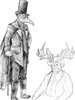
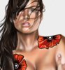
I'm going to pop in really quick with some advice. The solid line around the face would work in any situation where the head isn't tilted up, but in this case it looks really out of place and is rather distracting (at least to me)
The character's left foot looks good, but the right foot (to our left) looks really skinny and flat, although I suppose the pants may have something to do with making it look so odd. Other than those slight issues (and the background that was added in just to fill space), the piece looks really nice. Good job.
Thank ya for the advice! I appreciate it. I intend on filling in the background once I learn how to color water and stone decently, just wanted to get critiques on the chick.
Thank ya for the advice! I appreciate it. I intend on filling in the background once I learn how to color water and stone decently, just wanted to get critiques on the chick.
I am glad that you took my critique in as positive light as I could have hoped for. I know some artists that think theya re the best in the world, and think anyone that give any criticism is a heretic that should be burnt at the stake.
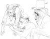
Quick few words of critique: While it's infinitely better than I can do, the index finger is supposed to end only a little ways past the final joint in the middle finger. Also, if you are going to add a little bit of shadow into one place, namely the bottom of the ring finger, then I recommend adding a bit in everywhere, even if only a little, to help one progress through the image.
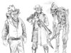
Unfortunately... well I mean I’m not sorry but most everything I do has nudity, maybe I can find one without nakedness... please hold... yeah, hard to find art that’s not against the rules... FYI many of these characters are all my intellectual property and a part of a story Im writing... copyright...