• Before posting a question, please check our Frequently Asked Questions page as well as previous threads here. Odds are you aren't the first to ask, and you may find the answer without having to post!

Home Page Layout: My Issue

Do you think the current layout best promotes RPN?

  • Launch Hammy Budha out the window, He's just talking crazy

    Votes: 0 0.0%
  • Stare at Hammy Budha and wonder if he may have a point, but not sure

    Votes: 0 0.0%
  • Pick Up and Hammy Budha and love him for being right

    Votes: 0 0.0%

  • Total voters
    0

Serano

Member
First off, I know that I can customize the layout to my personal preferences, but this isn't about just what I want. I'm writing this article because I believe that a default layout change would be what is best for the site. That out of the way, let me explain what I don't like about the current setup:


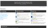
When I first log onto the website, I'm greeted to this four column blob in front of my face. Contrary to what you may think, I'm not actually super opposed to an idea of a section at the top to show new and exciting rps are starting up. But when the first section is all about "categories", which you already can just scroll down and find... it seems like a waste of space. Same too with the "top rps", it's the same thing everyday I log in.


Now I've recently been informed, (thanks to @Kagura) that these are just the "Role Plays" that are being put onto this section. This actually further reinforces my argument though and here is why. It doesn't show the image of an active, and vibrant website. It looks stagnant when not only am I seeing the same thing day after day, but the same things in each column. For a site like this to survive, it must be maturation for new ideas.


This is actually where I think the point is this section is lost. What I would do with this area, is have an area that is advertising the most popular RP's of just the last 24 hours... or maybe 72, I don't know. The fact that it is constantly updating, is awesome! I want to log on, and see something and be like, "That sounds interesting, I want to check that out." Does the current setup accomplish this? Do you see any thing in those columns that make you want to click on it to check it out?


Also, the column idea just seemed cluttered, forced, and clunky. Why not just make it stream? A rolling bar that is updating... or something along those lines. Because another point I think is missed it moving the shoutbox beyond the open page. This is another way that RPN users can communicate and get engaged with the community.


Actually, that's my main argument against the way this is right now. It doesn't engage anyone! Having columns that are old news, that no one is interested, doesn't make anyone want to refresh the page to check it. Think of the lost hits, because if that real estate was used to check for recent posts... at least then you'd have a reason to keep hitting that.
 
Now I've recently been informed, (thanks to @Kagura) that these are just the "Role Plays" that are being put onto this section.
I think you misunderstood me.


It's showing the recent/popular rps that have been made in the new roleplay section (The recently launched one) instead of 'all' the rps.


Why it doesn't update often is most likely due to the fact no one had been using the new roleplay layout, afterall it just launched a few days ago and it's been changing since then.
 
Since the new role play layout is just that (new), it requires a tad bit of reformatting. I am less worried about our site looking "stagnant" because well...


<p><a href="<fileStore.core_Attachment>/monthly_2013_10/57a8be573a4e7_stagnentsite.png.d49b073801a6d2cb63e10cb4e3349a07.png" class="ipsAttachLink ipsAttachLink_image"><img data-fileid="8722" src="<fileStore.core_Attachment>/monthly_2013_10/57a8be573a4e7_stagnentsite.png.d49b073801a6d2cb63e10cb4e3349a07.png" class="ipsImage ipsImage_thumbnailed" alt=""></a></p>


I am far more worried about getting users to convert to the new system rather than minor layout issues.

This is actually where I think the point is this section is lost. What I would do with this area, is have an area that is advertising the most popular RP's of just the last 24 hours... or maybe 72, I don't know. The fact that it is constantly updating, is awesome! I want to log on, and see something and be like, "That sounds interesting, I want to check that out." Does the current setup accomplish this? Do you see any thing in those columns that make you want to click on it to check it out?
How do you determine the most popular role play? If by ratings & comments than that is what the "Most Populer" section IS. The fact that you see the same role plays is because we JUST launched this tool today. Give it a week & we can revisit this conversation because at this time, we do not have enough user entries to judge the validity of this tool.


I appreciate your feedback & always have the best intentions for this site. I really do appreciate what you have brought forward & will work harder to ensure the modification is up to par.


-------------------------------------------------------------------------------


Few minor tweaks since the above was mentioned.


1, Removed "Random" role plays so it seems less like 3 mashed up columns & now more of just 2 mashed up columns.


2. I was never really found of the gray links on this site anyways so I made some color changes. This name breaks up the font a bit more.


3. Newest RPs is an INSTANT feature. If you posted an RP right now it would display on the main page. As the RPs start rolling in, this will be far less static.


4. Most popular is based of of the ratings system so as more role plays are rated, they are bound to appear.


<p><a href="<fileStore.core_Attachment>/monthly_2013_10/57a8be5740c59_layoutupdate.png.c71e748298a5f83ff8eb74ea3a82afd0.png" class="ipsAttachLink ipsAttachLink_image"><img data-fileid="8723" src="<fileStore.core_Attachment>/monthly_2013_10/57a8be5740c59_layoutupdate.png.c71e748298a5f83ff8eb74ea3a82afd0.png" class="ipsImage ipsImage_thumbnailed" alt=""></a></p>


Attachments

  • stagnent site.png
    stagnent site.png
    49.1 KB · Views: 39
  • layout update.png
    layout update.png
    83.8 KB · Views: 68
Last edited by a moderator:
Kagura said:
I think you misunderstood me.
It's showing the recent/popular rps that have been made in the new roleplay section (The recently launched one) instead of 'all' the rps.


Why it doesn't update often is most likely due to the fact no one had been using the new roleplay layout, afterall it just launched a few days ago and it's been changing since then.
That was what I was referring to. And I do understand that it will take time for the system to take off, but in the mean time, I still think it's a missed opportunity. And I actually am surprised as well that when you actually click on the links in the categories. And to my discovery I realize that because it is indeed tied to the new system, it doesn't show the current active role plays.


Ace, I'm not saying that RPNation isn't a very popular site and gets a lot of traffic. I'm giving this opinion not to criticize or demean this site, or the hard work you and others put into it. On the contrary, I want this site to succeed which is why I bring all this up. I actually really like the idea of popping on and seeing all the new rps being created, and it makes it much easier then flipping through individual forums.


However, think about if someone new comes on who isn't a regular. The first time a person comes on here, there are met at the top by the options and then the three separate columns. Their first instinct, (as would mine when checking out a new site) is to look at those rps. Most people will select one of those categories to check out what rps their are, to find that their are very few rps on there, which may lead to the erroneous perspective that there aren't a lot of rps.


Or, they may notice at the top of the screen it where it says "Role Plays." If one was to go and click on it and go into that new area, then they would miss out on 90% of the role plays on the site, I mean look at @Riddle78 great new RP starting up (or has I think.) Because it isn't in that area, it's not getting the ability to be advertised. He's a damn good story writer, and unless people know of him (which if their new here, they won't) they won't know that his RP is buzzing or whatever.


I know it just went "official" but the beta's been up for a while. All I'm saying, is that based on first impressions of someone *new*, I don't believe that the layout is the best for that purpose. And that was the reason why I mentioned the site being (potentially) confusing.


Also, why is the homepage still the traditional forums and shoutbox setup we are use too if this new system is to be the focus for RPN? And do not mistake me, after looking over the idea I actually really do like it. Not only does it give the perception of a website with a wide, a diverse array of RPs to choose from, but it also gives much easier way for RPs to be advertised. Not to mention the fact that I really like idea of unifying everything RPN into a single interface. It looks more impressive than the blurb currently on the home page to advertise it. That's probably my biggest beef with it, it does a disservice to the new system you and others have created.


Finally, I don't think this system is ready for prime time. What's the percentage of threads being created in the tradition RP threads as opposed to this new RP Section? Yes it just went live, but it's in beta for a while right?. And mad props go to @Don Valence and @Darth Pai for creating marvelous rps within this area, that are driving traffic towards that new area. But there are still a lot of rps being created in the traditional forums, more so than in this new system. No one sees the chat box when they first come on (before registering), so they don't know about the others unless they go looking themselves. Until the split is more even, I would argue, it shouldn't be the focus... if this makes sense?


I really hope I have angered either you Ace, or Kagura, or anyone else with these thoughts. It's not my intention to stir up any mess. I wish I would of made the comments before it went "live" as it would of been more appropriate there. I've said what I've needed on the subject, thank you for your time.
 
I really hope I have angered either you Ace, or Kagura, or anyone else with these thoughts.
Whoops! =) Not at all angered.


Beta was only open to 5 people. The old way is still alive however the new way is simply suggested. So far the positive feedback has been outstanding. I think once you see them begin to roll in (the new people will only know the new way) then you would have a quick change of mind.


I hope you seen my super quick layout update.
 
I did indeed, and it is much better. Looks like it's belongs there, than something that was just put there. Matches with the format, the whole first look is more busy... in a good way though. And I'm glad to hear you weren't angered. Don't think I'd be a happy hamster with god mad at me...
 
Most people will select one of those categories to check out what rps their are, to find that their are very few rps on there
Actually, the cateogries lead back to the regular rps section, not the new one xP
 

Users who are viewing this thread

Back
Top