

cadence
in a quiet garden
[COLOR= rgb(90, 90, 90)]Don't get me wrong, I don't know much about HTML. I honestly didn't even know what HTML was before RPN replaced BBCode with it, and you can only imagine how much I have binge learned some stuff - and it's still confusing as Hell. I only understand how to do inline stuff and nobody likes me enough to tell me how they do their pretty coding, but that doesn't mean I don't know anything! Some stuff has already been explained by other people who know how to do some coding, do I'm just gonna show you what I don't think has been mentioned before. [/COLOR]Google Fonts[COLOR= rgb(90, 90, 90)]If you haven't noticed. I am currently using a Google font - one of my favorites, Raleway. This is a really simple thing to do and I am about to show you how! [/COLOR][COLOR= rgb(90, 90, 90)]In your coding, between your <div> tags, you will have a code like this:[/COLOR]
Font-Family:Google Font Name;
You don't have to worry about adding plus signs for fonts with more than one word. It's fine, it works when you don't put them. You add all of your other coding after that, yada yada, pretty simple stuff. However, just typing in the code above won't do anything to give your text a cool font just yet. To do that, you'll have to do the following. This part is trickier, but still really easy.
<link rel="stylesheet" type="text/css"
href="https://fonts.googleapis.com/css?family=Font-Name">
You put this at the very end of your coding - the very very very end, after the </div> tags. Where it says 'Font-Name' at the end is where you'll obviously put the name of your Google font, but this time, if the font has more than one word, rather than using a space like you would with the earlier code.
<div style=" font-family:Raleway;">
Your code should look something like this.
</div>
<link rel="stylesheet" type="text/css"
href="https://fonts.googleapis.com/css?family=Raleway">
Text Shadow
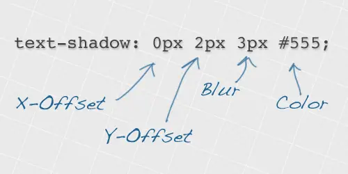
You see the little headers I have for the different codes? I did that with this simple little code - a bit trickier than Google Font-ing in my opinion, but it's really easy when you get the hand of it. I have an image right here that shows the different parts of the code pretty well.
You use this code the way you would just about any other inline code, unlike the Google Font code, though, there is no link you have to insert at the bottom.
<text-shadow:5px 5px 5px #hexcode;>
Now that part is simple, I use the code #aaa for my hexcode most of the time when using black text color and it works great. You get a result that looks something like the headers. But wait ~ there is more! I'm gonna show you some cooler things you can do using this really cool friggin' code!Multiple Text Shadows
This is practically the same thing as your regular old text shadows, except you're adding more colors or blur or whatever to it. It is incredible simple, divided by a simple comma and then repeated. I don't believe there is a limit on how many times you can do it either. Just always separate it with a comma, bro.
text-shadow:5px 5px 5px #hexcode, 5px 5px 5px #hexcode;"
Some Double Shadow Effect Idk What to Call
This effect is made up of two text shadows, but the first one is set to the same color as the background to give the impression that the second shadow is offset to the bottom right. Remember to make sure your first shadow colour is set to the same colour as your page background, and the text and second shadow also both use the same colour. Using this code:
<div style="
color:darkgray;
background-color:black;
font-family:Amatic SC;
text-shadow:5px 5px 5px black, 5px 5px 5px darkgray;">
<span style="font-size:72px;">Lorem Ipsum</span>
</div>
<link href="https://fonts.googleapis.com/css?family=Amatic+SC" rel="stylesheet" type="text/css">
You should get something like this
Neon Effect
This particular effect takes eight levels of shading. The base text is given a white fill, then each of the 8 text-shadow values are given larger and larger blur amounts while also getting darker. This blends between a vivid white inner glow and the large purple outer aura. Use this code:
<div style="text-shadow: 0 0 10px #fff, 0 0 20px #fff, 0 0 30px #fff, 0 0 40px #ff00de, 0 0 70px #ff00de, 0 0 80px #ff00de, 0 0 100px #ff00de, 0 0 150px #ff00de;background-color:black;">
<span style="font-size:72px;font-family:Amatic SC"> Sample</span>
</div>
<link href="https://fonts.googleapis.com/css?family=Amatic+SC" rel="stylesheet" type="text/css">
IT probably looks better with Different Fonts/Text Color
Stay tuned for more!
View full tutorial
Font-Family:Google Font Name;
You don't have to worry about adding plus signs for fonts with more than one word. It's fine, it works when you don't put them. You add all of your other coding after that, yada yada, pretty simple stuff. However, just typing in the code above won't do anything to give your text a cool font just yet. To do that, you'll have to do the following. This part is trickier, but still really easy.
<link rel="stylesheet" type="text/css"
href="https://fonts.googleapis.com/css?family=Font-Name">
You put this at the very end of your coding - the very very very end, after the </div> tags. Where it says 'Font-Name' at the end is where you'll obviously put the name of your Google font, but this time, if the font has more than one word, rather than using a space like you would with the earlier code.
<div style=" font-family:Raleway;">
Your code should look something like this.
</div>
<link rel="stylesheet" type="text/css"
href="https://fonts.googleapis.com/css?family=Raleway">
Text Shadow
You see the little headers I have for the different codes? I did that with this simple little code - a bit trickier than Google Font-ing in my opinion, but it's really easy when you get the hand of it. I have an image right here that shows the different parts of the code pretty well.
You use this code the way you would just about any other inline code, unlike the Google Font code, though, there is no link you have to insert at the bottom.
<text-shadow:5px 5px 5px #hexcode;>
Now that part is simple, I use the code #aaa for my hexcode most of the time when using black text color and it works great. You get a result that looks something like the headers. But wait ~ there is more! I'm gonna show you some cooler things you can do using this really cool friggin' code!Multiple Text Shadows
This is practically the same thing as your regular old text shadows, except you're adding more colors or blur or whatever to it. It is incredible simple, divided by a simple comma and then repeated. I don't believe there is a limit on how many times you can do it either. Just always separate it with a comma, bro.
text-shadow:5px 5px 5px #hexcode, 5px 5px 5px #hexcode;"
Some Double Shadow Effect Idk What to Call
This effect is made up of two text shadows, but the first one is set to the same color as the background to give the impression that the second shadow is offset to the bottom right. Remember to make sure your first shadow colour is set to the same colour as your page background, and the text and second shadow also both use the same colour. Using this code:
<div style="
color:darkgray;
background-color:black;
font-family:Amatic SC;
text-shadow:5px 5px 5px black, 5px 5px 5px darkgray;">
<span style="font-size:72px;">Lorem Ipsum</span>
</div>
<link href="https://fonts.googleapis.com/css?family=Amatic+SC" rel="stylesheet" type="text/css">
You should get something like this
Neon Effect
This particular effect takes eight levels of shading. The base text is given a white fill, then each of the 8 text-shadow values are given larger and larger blur amounts while also getting darker. This blends between a vivid white inner glow and the large purple outer aura. Use this code:
<div style="text-shadow: 0 0 10px #fff, 0 0 20px #fff, 0 0 30px #fff, 0 0 40px #ff00de, 0 0 70px #ff00de, 0 0 80px #ff00de, 0 0 100px #ff00de, 0 0 150px #ff00de;background-color:black;">
<span style="font-size:72px;font-family:Amatic SC"> Sample</span>
</div>
<link href="https://fonts.googleapis.com/css?family=Amatic+SC" rel="stylesheet" type="text/css">
IT probably looks better with Different Fonts/Text Color
Stay tuned for more!
View full tutorial